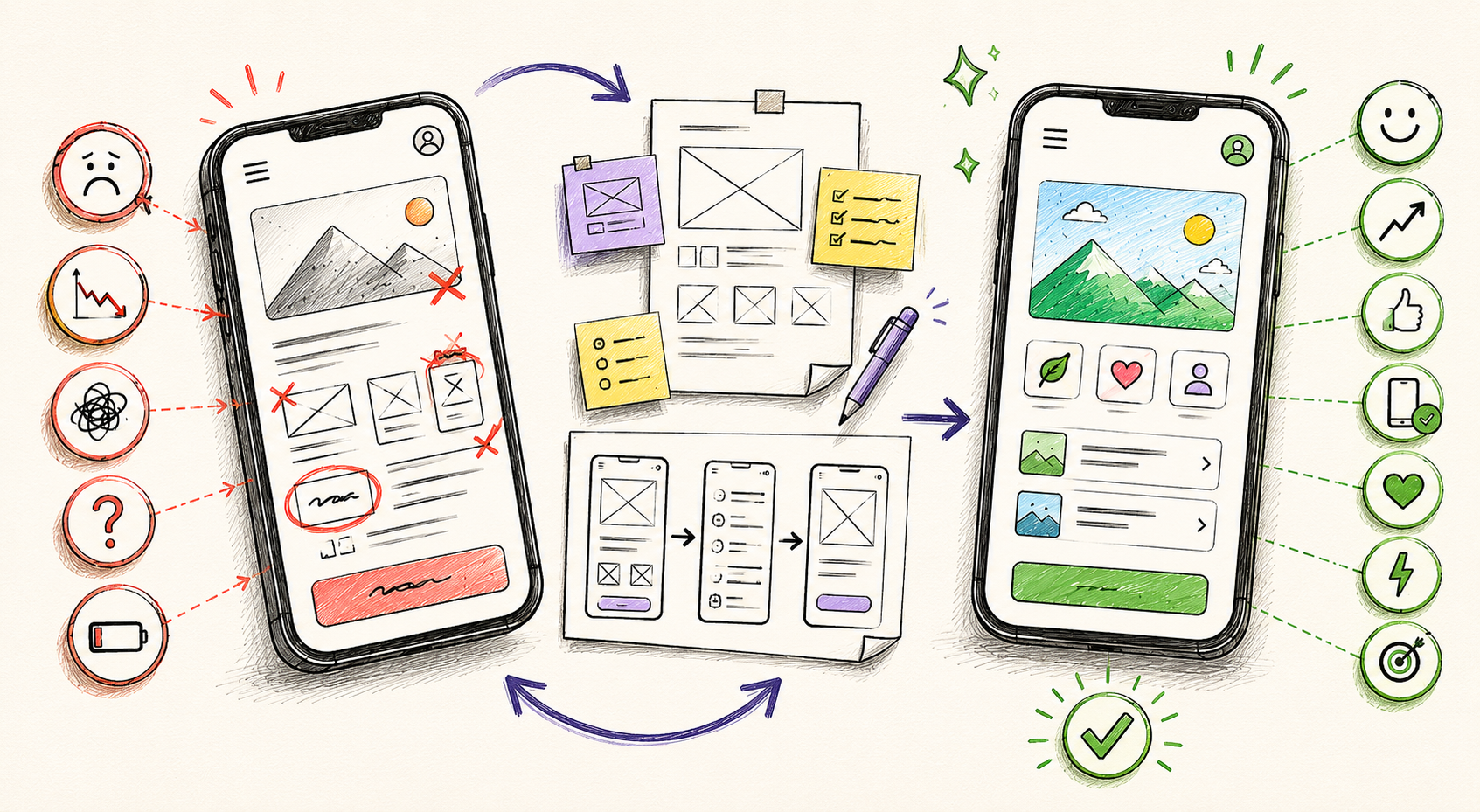
Not every product launches with perfect design. Many start with a functional but imperfect experience and improve over time. But there is a difference between a product that is a work in progress and one that is silently bleeding users and revenue because of unresolved UX problems.
The challenge is that poor UX rarely announces itself loudly. Users do not usually send detailed feedback explaining which flow confused them. They simply stop using your product. They churn. They leave one-star reviews mentioning that the app is “confusing” or “hard to use.” They tell their friends to avoid it.
If you recognize any of the signs below in your product, it is time to take UX seriously. Here are seven clear indicators that your product needs a UX redesign and what you should do about each one.
Sign 1 — Your Drop-Off Rates Are High at Specific Steps
If your analytics show that users are consistently dropping off at the same point in a flow, that is a UX problem. It means something about that step is creating enough friction to make users give up entirely.
Common culprits include:
- A form that asks for too much information too early
- A confusing decision point where users do not know which option to choose
- An error state that is not clearly explained
- A page that loads slowly and loses impatient users
What to do: Use heatmaps and session recordings (tools like Hotjar or Microsoft Clarity) to see exactly where users are clicking, hesitating, and leaving. Then prioritize redesigning those specific flows.
Sign 2 — Users Cannot Complete Key Tasks Without Help
If your customer support team is regularly fielding questions like “How do I find X?” or “Where do I change Y?” that is a direct signal that your product’s UX is not doing its job. Intuitive products do not require instruction manuals.
Good UX makes the right next step obvious at every moment. If users are confused often enough to reach out for help, the design is not communicating clearly.
What to do: Conduct moderated usability testing where you ask representative users to complete key tasks without guidance. Observe where they hesitate, take wrong turns, or ask for help. These moments reveal exactly which parts of the product need redesign.
Sign 3 — Your App Store or Product Reviews Mention Confusion or Difficulty
Customer reviews are one of the most honest forms of user feedback available. When users take the time to leave a review mentioning that an app is confusing, hard to navigate, or unintuitive, that is a UX problem that is costing you downloads, conversions, and trust.
A pattern of UX-related complaints in reviews is a strong signal that the issues are widespread, not isolated to a few users.
What to do: Audit your reviews systematically. Categorize complaints related to navigation, confusing features, difficulty completing tasks, and unclear language. Use these categories to prioritize the areas of your product that need the most attention in a redesign.
Sign 4 — Your Onboarding Completion Rate Is Low
Onboarding is the first real experience a new user has with your product. If users are not completing your onboarding flow or are dropping off before reaching the first “aha moment,” your product is starting every relationship on the wrong foot.
Poor onboarding UX costs you users who were already interested enough to sign up. These are warm leads that leave because the product failed to show its value quickly and clearly.
What to do: Redesign your onboarding flow around a single goal: get the user to their first meaningful success as quickly as possible. Remove every unnecessary step. Delay asking for permissions, profile information, or payment details until after the user has experienced real value.
Sign 5 — Your Product Has Grown But the Design Has Not Kept Pace
Products that start small and grow quickly often develop what designers call UX debt. New features get added without a coherent design system. Navigation gets more complex. The original information architecture no longer makes sense for the expanded product.
The result is a product that feels stitched together rather than designed. Users who have been around for a while know where things are from muscle memory, but new users find it overwhelming or illogical.
What to do: Conduct a full UX audit of your existing product. Map every screen, every flow, and every navigation path. Identify inconsistencies, redundancies, and structural problems. A full redesign that addresses IA and design system consistency can dramatically improve new user activation.
Sign 6 — Your Conversion Rate Is Not Improving Despite Traffic Growth
If you are driving significant traffic to your product or website but conversion rates are flat or declining, UX is almost certainly part of the problem. Traffic is the top of the funnel. UX is what converts that traffic into users, customers, and revenue.
Common conversion killers include:
- Unclear value propositions on landing pages
- Too many steps between landing and conversion
- Trust signals missing at key decision moments
- Poor mobile experience losing a large segment of traffic
- Confusing or intimidating sign-up flows
What to do: Run a conversion-focused UX audit of your acquisition funnel. Identify every point between first click and conversion and evaluate how well the design supports the user’s decision to proceed at each step.
Sign 7 — Your Design Looks Dated Compared to Competitors
Design trends evolve. What looked modern and professional three years ago may now look dated, which affects how users perceive your brand and product quality. Users make subconscious judgments about product credibility based on visual design within milliseconds of landing on a screen.
If your competitors have refreshed their product design recently and yours has not, you may be losing deals and sign-ups simply because you look less professional and trustworthy.
What to do: Conduct a competitive visual audit. Compare your product side by side with two or three top competitors. Assess typography, color, component design, spacing, and overall visual language. If the gap is significant, a visual redesign aligned with your UX improvements can dramatically reposition your product in users’ minds.
What Comes After Identifying the Signs: The UX Redesign Process
Recognizing the problem is the first step. Fixing it effectively requires a structured process. A thorough UX redesign typically follows these stages:
- Discovery and Audit: A full review of analytics, user feedback, and heuristic evaluation of the existing product
- User Research: Interviews and usability testing with current and target users
- UX Strategy: Defining the redesign’s goals, principles, and success metrics
- Information Architecture Redesign: Restructuring navigation and content for the redesigned product
- Wireframing and Prototyping: Designing and testing new flows before visual design begins
- Visual Redesign: Applying updated visual language across all screens
- Development Handoff and QA: Ensuring the redesigned experience is built accurately
CONCLUSION
Poor UX does not fix itself over time. The longer these problems go unaddressed, the more users you lose and the harder it becomes to turn perception around. The good news is that every one of these signs is fixable with the right process and the right team.
Whether your product needs targeted flow improvements or a comprehensive redesign, the starting point is the same: understanding exactly where and why users are struggling.