INTRODUCTION
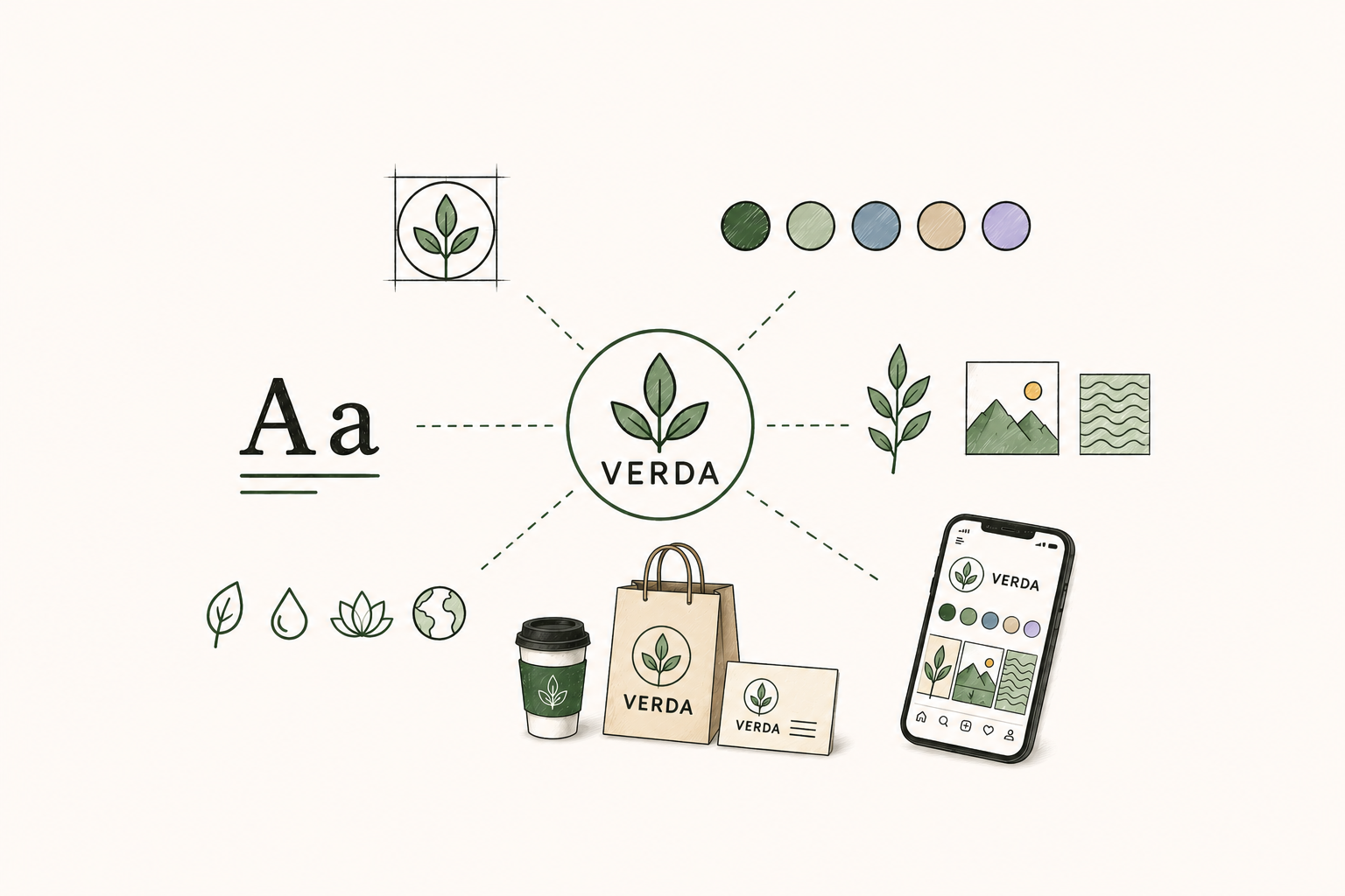
Most people think of a brand as a logo. And while a logo is important, it is just one piece of a much larger system. The brands that earn lasting recognition and loyal customers are built on a foundation of multiple interconnected elements, each working together to create a consistent, compelling identity.
Think of a great brand the way you would think of a great building. The logo is the front door, recognizable and inviting. But behind it is a complete structure: the layout, the materials, the lighting, the details that make the entire experience feel intentional and cohesive.
In this blog, we break down every element that makes up a great brand identity, what each one does, and why all of them matter.
The Two Layers of Brand Identity
Before diving into individual elements, it helps to understand that brand identity operates on two levels.
The strategic layer is the thinking behind the brand: the purpose, values, personality, and positioning that define who the brand is and what it stands for. This layer is largely invisible to customers but it drives every decision made about the visual and verbal expression of the brand.
The expressive layer is everything customers see, hear, and read: the logo, colors, typography, imagery, tone of voice, and all the other elements that bring the strategic layer to life in the real world.
A great brand has both layers working in harmony. The visual and verbal identity is a direct expression of the strategic foundation. When that alignment is present, brands feel authentic, coherent, and trustworthy.
Element 1 — Brand Purpose and Values
Every great brand starts with a clear sense of why it exists beyond making money. Brand purpose is the deeper reason for being, the problem the brand is committed to solving or the change it wants to create in the world.
Brand values are the principles that guide how the brand behaves. They shape decisions about what to do and what not to do, how to treat customers, and what kinds of work the brand will and will not take on.
Purpose and values are internal foundations, but they show up everywhere externally. They inform the tone of voice, the types of imagery used, the causes the brand supports, and the way the brand responds in moments of crisis.
Brands that operate without a clear purpose and defined values tend to feel hollow. Brands that articulate and live their purpose and values tend to build genuine loyalty.
Element 2 — Brand Positioning
Brand positioning defines where the brand sits in the minds of its target customers relative to competitors. It answers the question: why should someone choose this brand over every other option available?
Positioning influences every other element of the brand. It shapes the visual tone, the messaging, the pricing, and the customer experience. A brand positioned around luxury looks, sounds, and behaves differently than one positioned around accessibility. A specialist brand communicates differently than a generalist one.
Without clear positioning, the rest of the brand identity lacks direction. With it, every design and communication decision has a strategic reason behind it.
Element 3 — Logo Design
The logo is the most immediately recognizable element of a brand’s visual identity. It is the mark that appears on every product, every document, every digital touchpoint, and every piece of marketing material the brand produces.
A great logo is not the most complex or the most beautiful. It is the most appropriate and the most distinctive for the brand it represents.
Strong logos share several characteristics:
Simplicity: A simple logo is easier to recognize and reproduce across a wide range of sizes and applications. The most iconic logos in the world are often the simplest.
Distinctiveness: A logo needs to stand out from competitors in the same category. Generic shapes and letter forms produce forgettable logos.
Versatility: A logo must work at any size, in color and monochrome, on light and dark backgrounds, in print and digital applications. A logo that only works in one context is a practical liability.
Timelessness: Logos built around current design trends look dated quickly. Great logos are designed to remain relevant for decades.
Most brands need a family of logo variations: a primary logo, a simplified mark or icon, a horizontal version, and a stacked version. Each serves a different application.
Element 4 — Color Palette
Color is one of the most powerful tools in a brand’s visual arsenal. It is processed faster than text and triggers emotional associations that influence perception and decision-making at a subconscious level.
Research consistently shows that color increases brand recognition by up to 80%. Think of how instantly you associate certain colors with certain brands even without seeing their name.
A brand color palette typically includes:
Primary colors: The main colors that define the brand’s visual identity and appear most prominently across all applications.
Secondary colors: Supporting colors that add range and flexibility to the system, used in backgrounds, accents, and graphic elements.
Neutral colors: The grays, whites, and creams that provide balance and give the primary and secondary colors space to breathe.
Every color in the palette should be documented precisely with hex codes for digital use and CMYK or Pantone values for print use, ensuring perfect consistency across every medium.
Element 5 — Typography
Typography is one of the most underestimated elements of brand identity. The typefaces a brand uses communicate personality before a single word is read. Serifs feel authoritative and established. Sans-serifs feel modern and accessible. Display fonts can feel bold, creative, elegant, or playful depending on their design.
A brand typography system typically includes:
A primary display font for headlines and large-format applications. This font carries the most brand personality and creates the strongest first impression.
A secondary body font for longer-form text, optimized for readability at smaller sizes.
Clear typographic rules covering size hierarchy, weight usage, line spacing, and letter spacing ensure that every piece of content using the brand’s fonts looks consistent and intentional.
Element 6 — Tone of Voice
Tone of voice is the verbal equivalent of visual identity. It defines how the brand speaks: the words it uses, the sentences it constructs, the personality it expresses through language.
A brand’s tone of voice should be consistent whether it is writing a website headline, a social media caption, a customer service email, or a product description. When the verbal identity is as consistent as the visual identity, the brand feels coherent and trustworthy from every angle.
Tone of voice is documented through a set of voice principles, a list of words the brand uses and words it avoids, and examples showing the difference between on-brand and off-brand communication.
Element 7 — Photography and Imagery Style
The photography and imagery a brand uses is a core part of its visual identity. Image style communicates mood, values, and personality just as powerfully as the logo and color palette.
Does the brand use bright, high-contrast lifestyle photography or dark, moody editorial images? Are the subjects real people in authentic situations or carefully art-directed compositions? Does the brand lean toward abstract visuals or literal product photography?
Defining a clear imagery direction means that every photo used across the brand’s website, social media, and marketing materials feels like it belongs to the same visual world.
Element 8 — Graphic Elements and Patterns
Graphic elements are the supporting visual language of the brand: custom icons, illustration styles, patterns, textures, shapes, and decorative details that extend the identity beyond the logo and color palette.
These elements give the brand visual flexibility. They provide a range of tools for designers and marketers to work with across different formats and applications without the brand ever feeling repetitive or restrictive.
Element 9 — Brand Guidelines
The final and perhaps most practically important element of a great brand identity is the brand guidelines document. This is the comprehensive reference that documents every element of the identity, how each should be used, and how they should never be used.
Brand guidelines ensure that the identity stays consistent as the brand grows, as more team members become involved in producing brand materials, and as external partners like agencies and printers need to work within the brand’s system.
Without guidelines, visual consistency is impossible to maintain at scale. With them, every piece of brand communication looks and feels like it comes from the same place.
CONCLUSION
A great brand is a system, not a single asset. Every element described above plays a specific role, and the power of the identity comes from all of them working together with consistency and intention.
Businesses that invest in building a complete brand identity, from strategic foundation to visual and verbal expression, build something that is genuinely difficult for competitors to replicate: a brand that people recognize, trust, and choose.